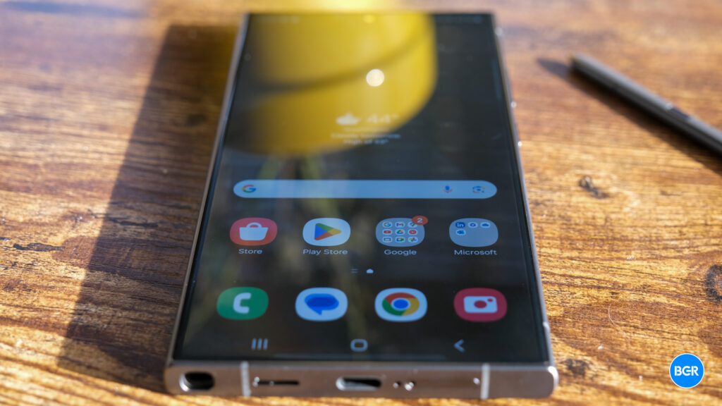
We’re entering Galaxy S25 rumors season now that the Galaxy Z Fold 6 and Flip 6 are out in stores. The next Samsung flagships are likely going to launch in early 2025, and the Ultra will be the best and most expensive version.
It makes even more sense to see an uptick in Galaxy S25 rumors at this particular time of year. Google just unveiled the Pixel 9 series, and Apple is about to launch the iPhone 16 models.
With that in mind, I’m not surprised to see the Galaxy S25 Ultra design appear in a leak from a trusted insider. I am amazed, however, to see Samsung already fix my biggest complaint with the Galaxy S24 Ultra: The annoying Note design.
By Note design, I mean a phone with flat sides on the top and bottom. This forces Samsung to give the Galaxy S24 Ultra rectangular corners instead of the rounded corners you see on its siblings and almost all other phones.
Tech. Entertainment. Science. Your inbox.
Sign up for the most interesting tech & entertainment news out there.
By signing up, I agree to the Terms of Use and have reviewed the Privacy Notice.
The Galaxy S24 Ultra has a built-in stylus placed next to one of the phone’s edges. As a result, the bottom side has to be flat. In turn, the top side becomes flat, as the handset’s top and bottom have to be symmetrical.
Those rectangular corners aren’t comfortable to hold, at least not to me. They’ll leave an impression in the palm of your hand. Sure, you might get used to it, and plenty of Galaxy S24 Ultra had to do it. But it can be an issue.
Thankfully, Samsung will fix the issue if Ice Universe’srender above is correct. The Galaxy S25 Ulra will feature more rounded corners than its predecessor. It’s still a boxy design, similar to the Galaxy Z Fold 6, but the corners look much better.
Since I mentioned the foldable, Samsung employed a rectangular design for the corners of the Fold 6 out of symmetry concerns. It’s the only way to make the cover screen look good. Otherwise, you’d end up with rectangular corners on the hinge side and curved corners on the opposite side.
Back to the Galaxy S25 Ultra design leak, Samsung will keep the stylus in place. That’s why the curvature of the corners is minimal.
The leaker also shared a render that puts the iPhone 16 Pro Max and the Galaxy S25 Ultra side by side:
I also thought the Galaxy S24 Ultra was too large to hold comfortably. According to a different post from the same leaker, the Galaxy S25 Ultra will feature a few changes to improve comfort.
Apparently, the Galaxy S25 Ultra will feature a narrower body than its predecessor. Smaller bezels will help increase the surface of the display in a slightly more compact body. Ice Universe didn’t provide measurements for the Galaxy S25 Ultra, however.
What is the biggest problem with the S24 Ultra design?
The number one flaw is that the horizontal screen-to-body ratio is too low. The body width is 79mm, of which only 72.3mm is the screen, and the remaining 6.7mm is all the frame and the middle frame, which makes the hand feel… pic.twitter.com/YjCVWgWeKi— ICE UNIVERSE (@UniverseIce) August 16, 2024
Can we trust this early Galaxy S25 Ultra leak? Rumors are rumors, and the information might be inaccurate. However, Galaxy phones always leak. The design is usually the first to appear in unofficial renders.
Given the timeframe and the source, I’d say it’s probably accurate or very close to it. Samsung is likely planning a January 2025 launch for the next Galaxy S series. The phones will head to production in the coming months. Samsung must have already finalized the designs for the Galaxy S25 series. Then there’s the iPhone 16 launch to disrupt such rumors.

