

Google has quietly started rolling out a big user interface redesign to Google Maps, although Android users will get it before it reaches the iPhone. This is the Google Maps UI update first spotted in beta testing in February. Google then unexpectedly paused work on it, only to return to testing the redesign in May.
As I said before, this Google Maps redesign will not roll back the colors to the original Google Maps palette you might still be missing. Instead, it cleans up the entire app experience, making the app easier and clearer to navigate.
I’m a longtime Google Maps user who religiously uses the app on the iPhone, and I’ve been dying to get the new UI. Even I sometimes get lost trying to find features and settings in Google Maps, especially when I’m in a hurry and want to get to my destination quickly.
According to 9to5Google, the Google Maps update is rolling out more widely to the stable version of the Android app. You’ll need version 11.136.x or later to get it.
Tech. Entertainment. Science. Your inbox.
Sign up for the most interesting tech & entertainment news out there.
By signing up, I agree to the Terms of Use and have reviewed the Privacy Notice.
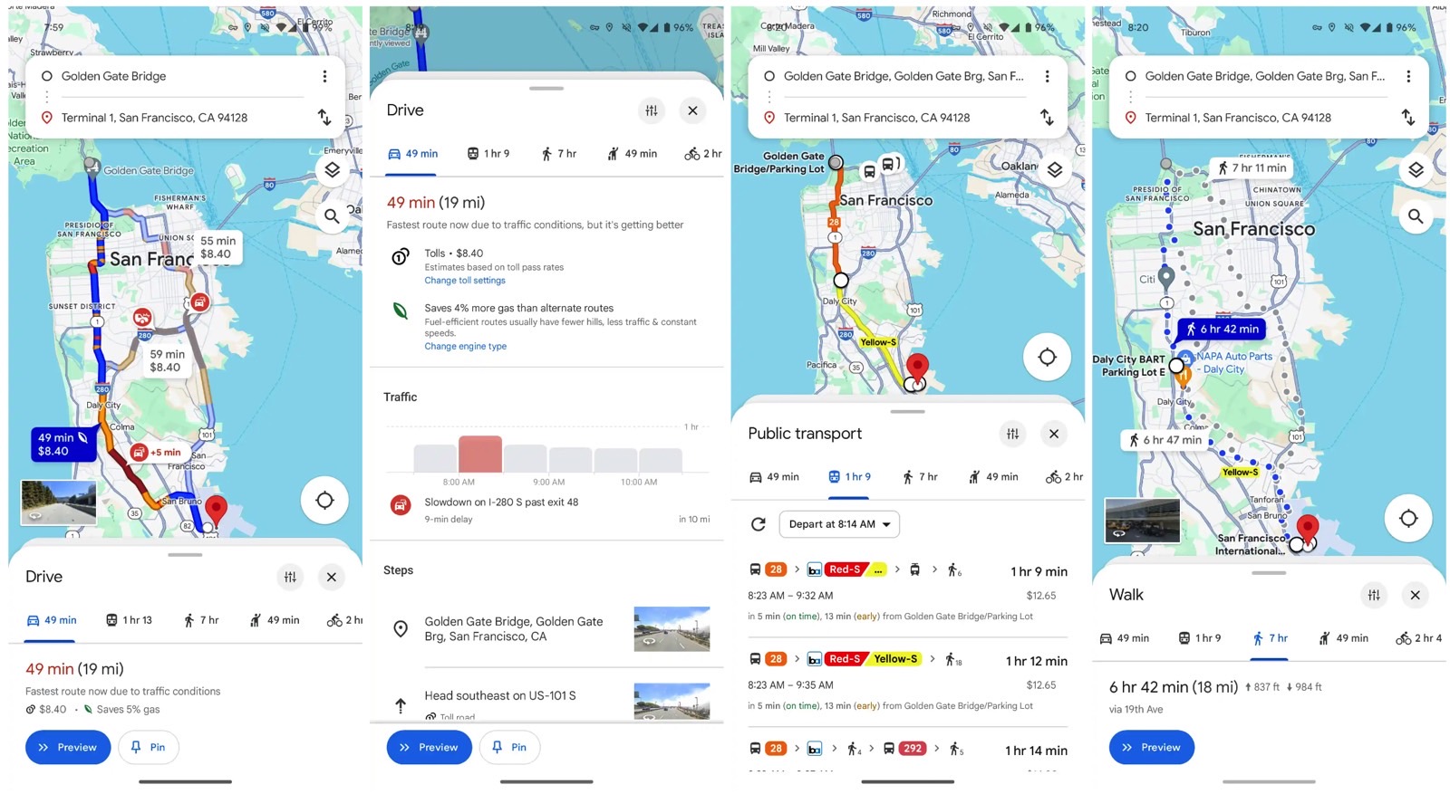
Once the new Google Maps UI rolls out to your device, you’ll see two big changes. The first concerns navigating the app’s various layers, and the second is a big UI change to the navigation menu.
Right now, every Google Maps experience takes over the screen. No matter whether you use the app for navigation purposes, to find places of interest around you, or just to read reviews for restaurants and attractions, you get the fullscreen experience. You then have to get back to the main screen. Navigating the app can be cumbersome, especially for newer users.
The UI redesign will replace that experience with a new layout. You’ll get a sheet covering a part of the display instead of the fullscreen layer that once occupied the same space. These sheets have rounded corners, so they’ll never give you a fullscreen experience. You’ll always know where you are in the app, and you’ll see the map behind that sheet.
 Google Maps design update: New UI for directions and navigation appeared in testing in February. Image source: 9to5Google
Closing those sheets to return to the map or the navigation screen is even easier than before. Just tap the “X” that appears in the right corner. Well, it’s not like you can’t go back to the map in the current Google Maps experience, but the new UI makes it all much easier.
Looking for directions will be even easier than before, and that’s the feature I want most from the Google Maps UI update. First, the screens will get much cleaner as Google is removing a lot of the white layer covering the map. This falls in line with the sheet layout above. You get rounded corners and see more of the map, as that boxy, fullscreen experience is going away.
Most importantly, the navigation screen will move the transportation options to the bottom. This is similar to having the URL field at the bottom of the screen in browser apps. It’s just that much easier to choose between driving, walking, and public transport.
It’s not clear when the new design will arrive in various regions, but the Android rollout shouldn’t take long. The iPhone update will likely follow, but it’s unclear when it’ll happen. Strangely enough, Google hasn’t formally announced the UI update for either platform.