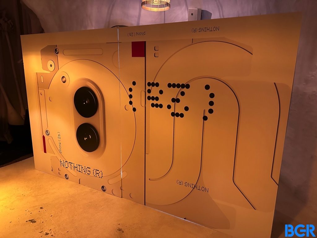
Nothing has been teasing the Phone 2a for the past few weeks now, ahead of the phone’s March 5th launch event. We already know plenty about the device, including an estimated price, some schematics that Nothing used while designing the phone, and a thorough explanation as to why Nothing picked a MediaTek chip. We also have confirmation that the transparency and Glyphs aren’t going away from Nothing’s design mantra.
What we don’t have, at least officially, are details that matter the most to smartphone buyers, especially Nothing fans. Nothing didn’t show off the phone itself or provide price points and detailed availability information alongside those teasers.
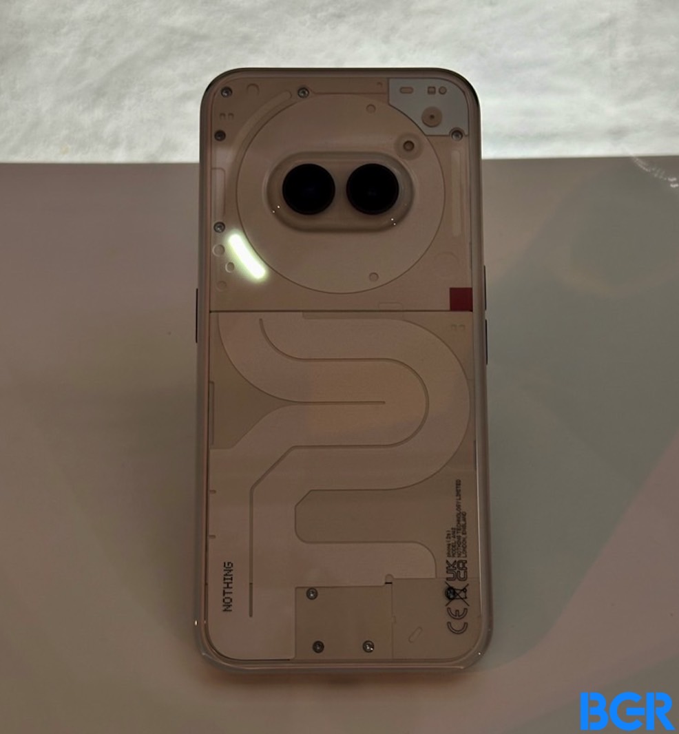 The Nothing Phone 2a design unveiled. Image source: Chris Smith, BGR
Nothing only detailed its philosophy for making this type of handset. It’s not a flagship like the Phone 2, but Nothing wants it to be the best possible mid-ranger. Nothing wants us to see this as a compromise-free device compared to its predecessors.
Will Nothing pull it off? It’s too early to answer that question, but here’s what I did learn after seeing the Nothing Phone 2a at MWC in Barcelona, Spain. (Well, not precisely at MWC, as the British smartphone startup still doesn’t have an official presence here.)
Tech. Entertainment. Science. Your inbox.
Sign up for the most interesting tech & entertainment news out there.
By signing up, I agree to the Terms of Use and have reviewed the Privacy Notice.
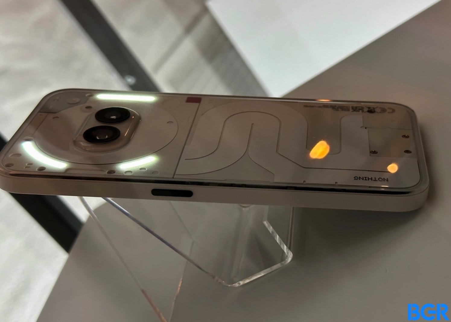 Nothing Phone 2a: We only get three Glyphs. Image source: Chris Smith, BGR
As in previous years, Nothing hosted an event during the event weekend outside the main MWC venue. That’s where the design of the handset was revealed.
This is all part of Nothing’s clever marketing campaign to drum up excitement about a new device ahead of the launch event by slowly revealing and confirming features. It’s also a way to stay ahead of the leaks, difficult as that might be.
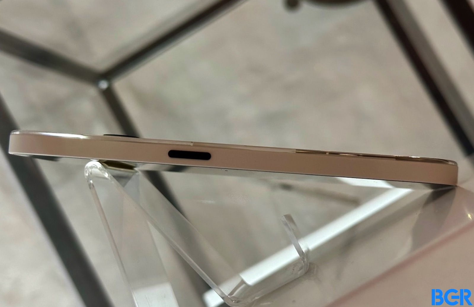 Nothing Phone 2a: Side view. Image source: Chris Smith, BGR
If the device in these images looks familiar, that’s because we saw leaks suggesting this particular design was in the works.
The Nothing Phone 2a maintains the transparency that the Phone 1 and 2 introduced. But it’s significantly reduced compared to those phones. Some fans might not like the design, but I kind of dig it.
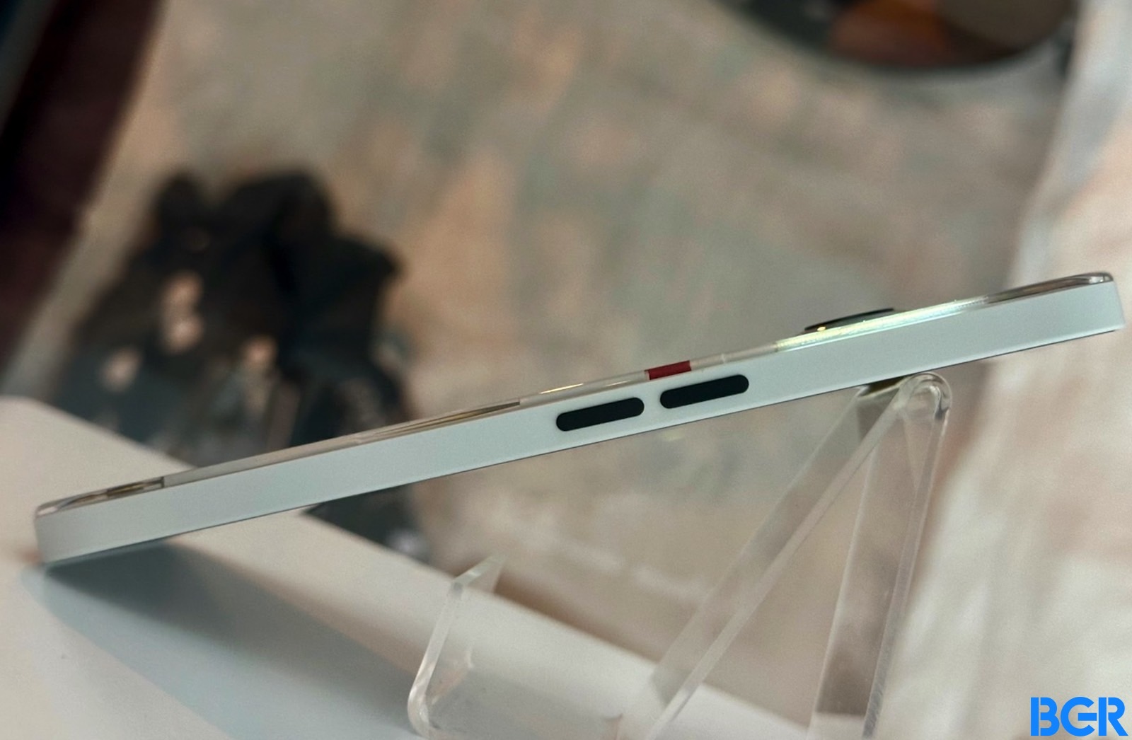 Nothing Phone 2a: The other side. Image source: Chris Smith, BGR
The Glyphs are also back, and I probably like the Phone 2a’s rear-facing illumination the most. That’s because we have fewer Glyphs than before. In the past few years, I’ve said I’m not a fan of this design detail. But that’s a matter of personal opinion. Others like the Glyphs and use them.
The Nothing Phone 2 looks amazing, though, even though it has an overly complex illumination scheme compared to the first-gen model for my taste.
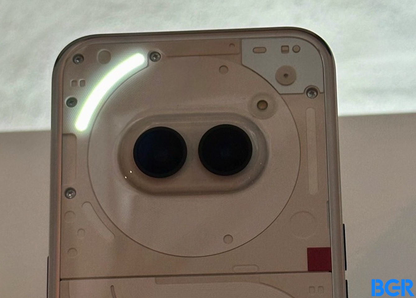 Nothing Phone 2a: Camera detail. Image source: Chris Smith, BGR
Unfortunately, I only got to look at the Nothing Phone 2a. We were not allowed to touch it. This is, after all, a great marketing stunt from the company.
The phone will come in white, or at least white will be the first color. That’s what I heard being whispered around me, though I was more focused on getting these shots.
As for the screen, it wasn’t shown — not that we need to really see it. It will be a hole-punch all-screen design, like every other Android. There’s nothing wrong with that, of course.
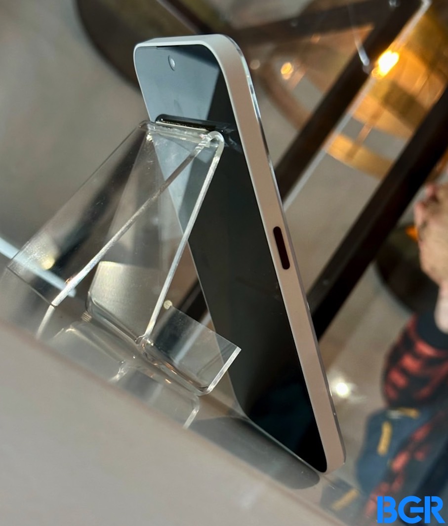 Nothing Phone 2a: The screen. Image source: Chris Smith, BGR
I did manage to sneak a quick shot of the screen, but that was all we got. The phone did not come out of those glass enclosures. Not while I was there, at least.
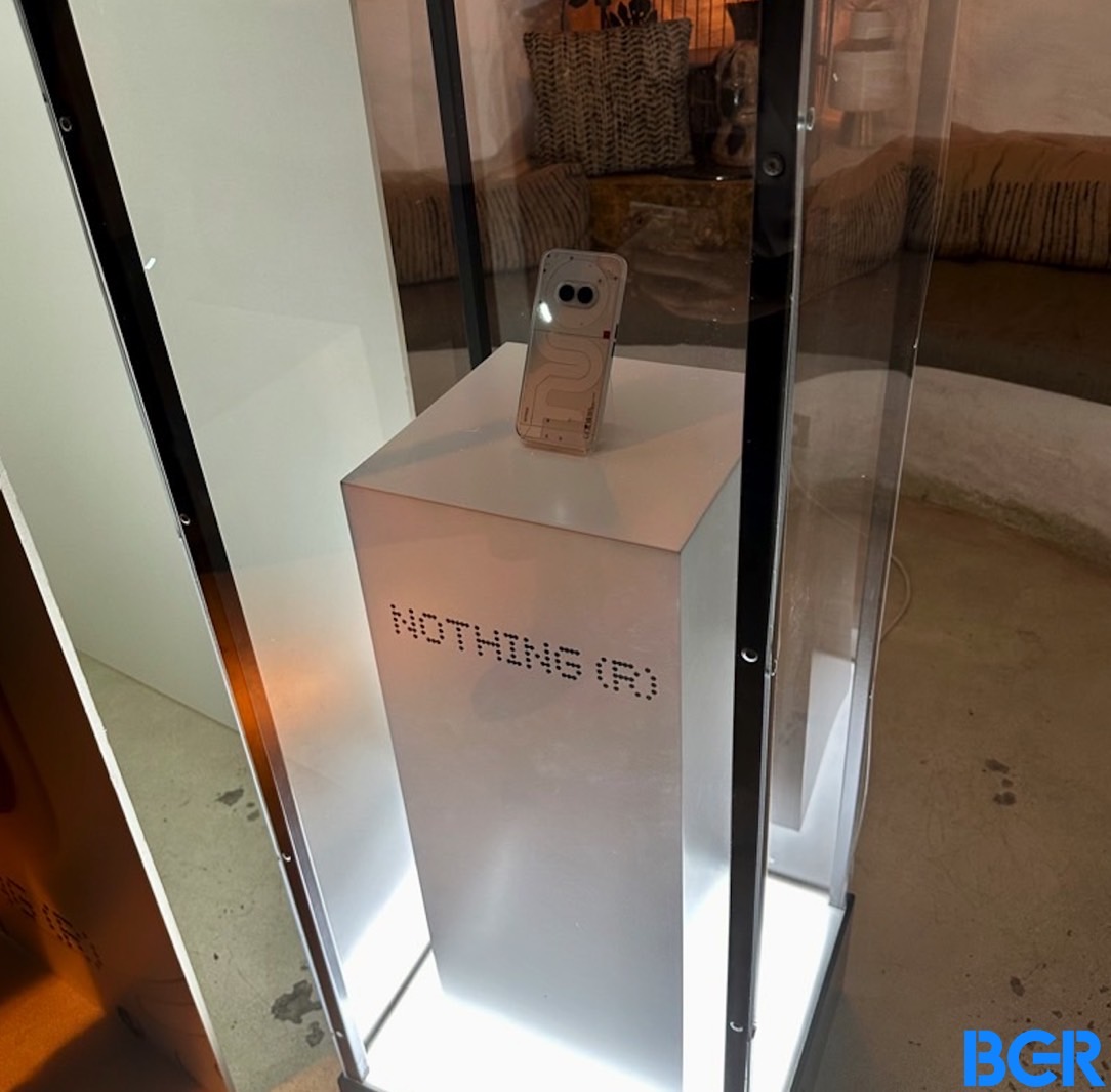 Nothing Phone 2a in a glass box. Image source: Chris Smith, BGR
Source

